ART DIRECTION • BRANDING SYSTEM DEVELOPMENT
Texas State University
Building the new Brand
Texas State recently acquired a new brand direction from 160/90. My role as a graphic designer and junior creative director was to lead the design team in adapting what was presented to us to fit our unique needs as the quirky, small town University that we are. With the use of chunky, delicious type paired with vibrant colors, the redesign captures the true spirit of Texas State.
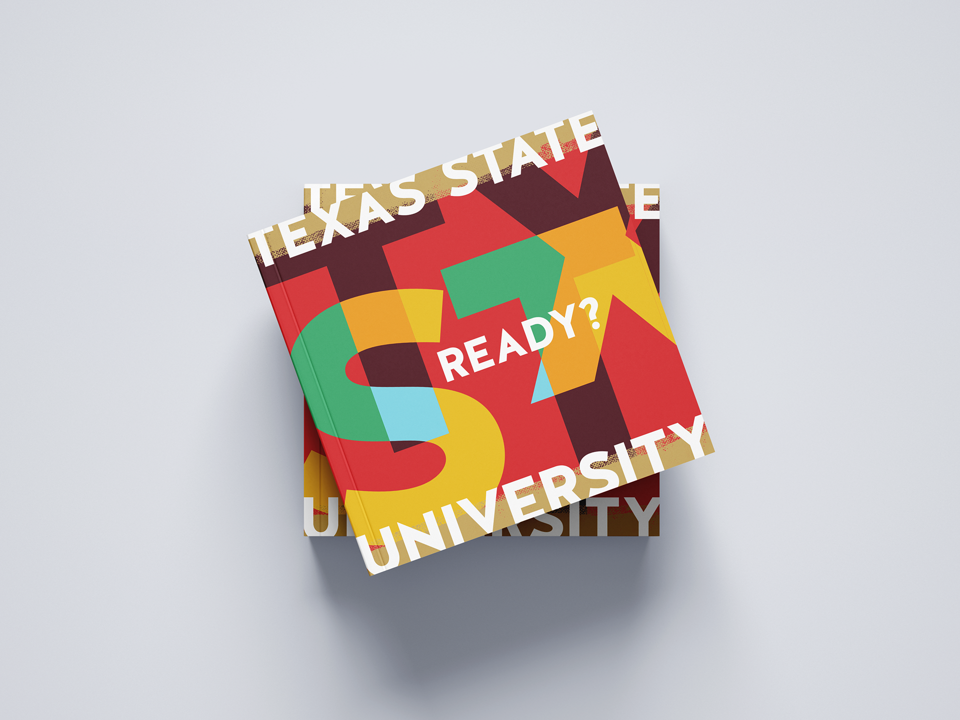
The Viewbook
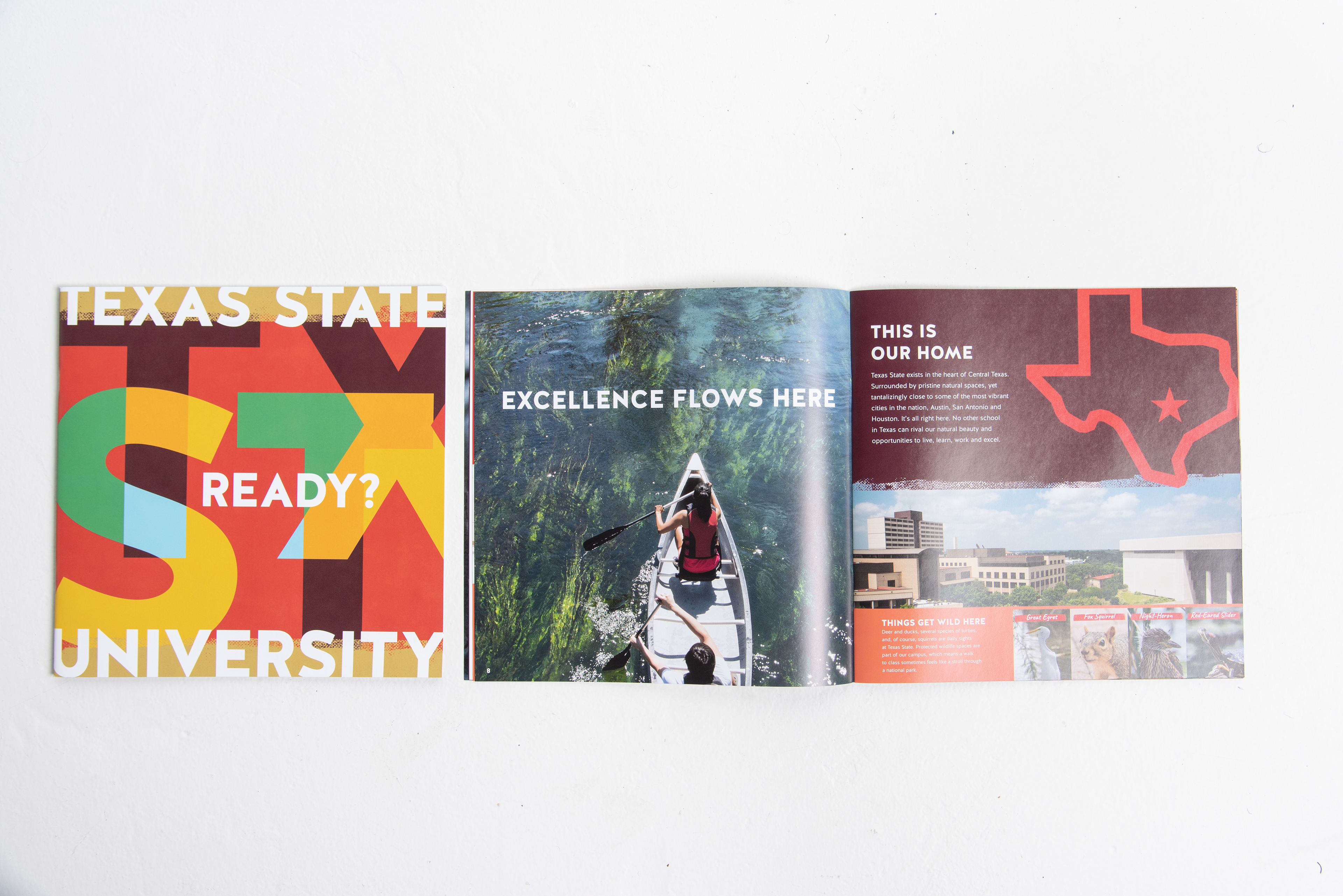
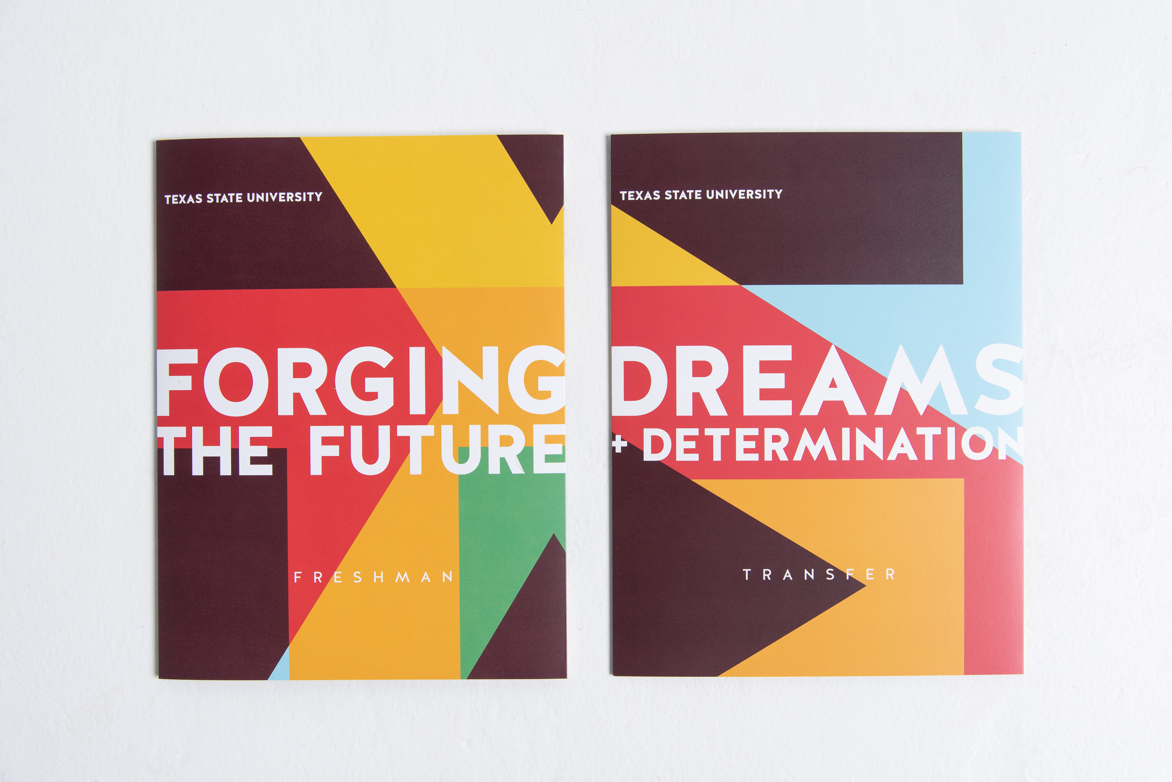
As a creative team, we each took our own directions to fruition for the cover design of the Viewbook, a publication that is used by admissions for recruitment. After presenting our wildly different ideas to the Admissions team, they chose to go with the direction that I created: a funky, bright, typography focused iteration. Over the next few months, we worked together to build out the brand to fit this new direction.
Art Direction of Photoshoots
Having a background in professional photography, I took on the role of providing art direction for the photo sessions that our photography team would shoot for the recruitment materials. Below are images from a PDF guide that was sent to students so they could get an idea of what we were looking for. The guide was also used as a guide for our photography team to capture the true personalities of Texas State scholars with encouragement to focus on vibrant colors to mirror our new brand colors and warm, natural lighting.
In the past, students would be under the impression that they should wear Texas State T-shirts to rep the University when showing up to a photo session with marketing and not really dress like they would on any other day. The goal of the PDF guide was for them to feel empowered to let their personalities and unique style shine.
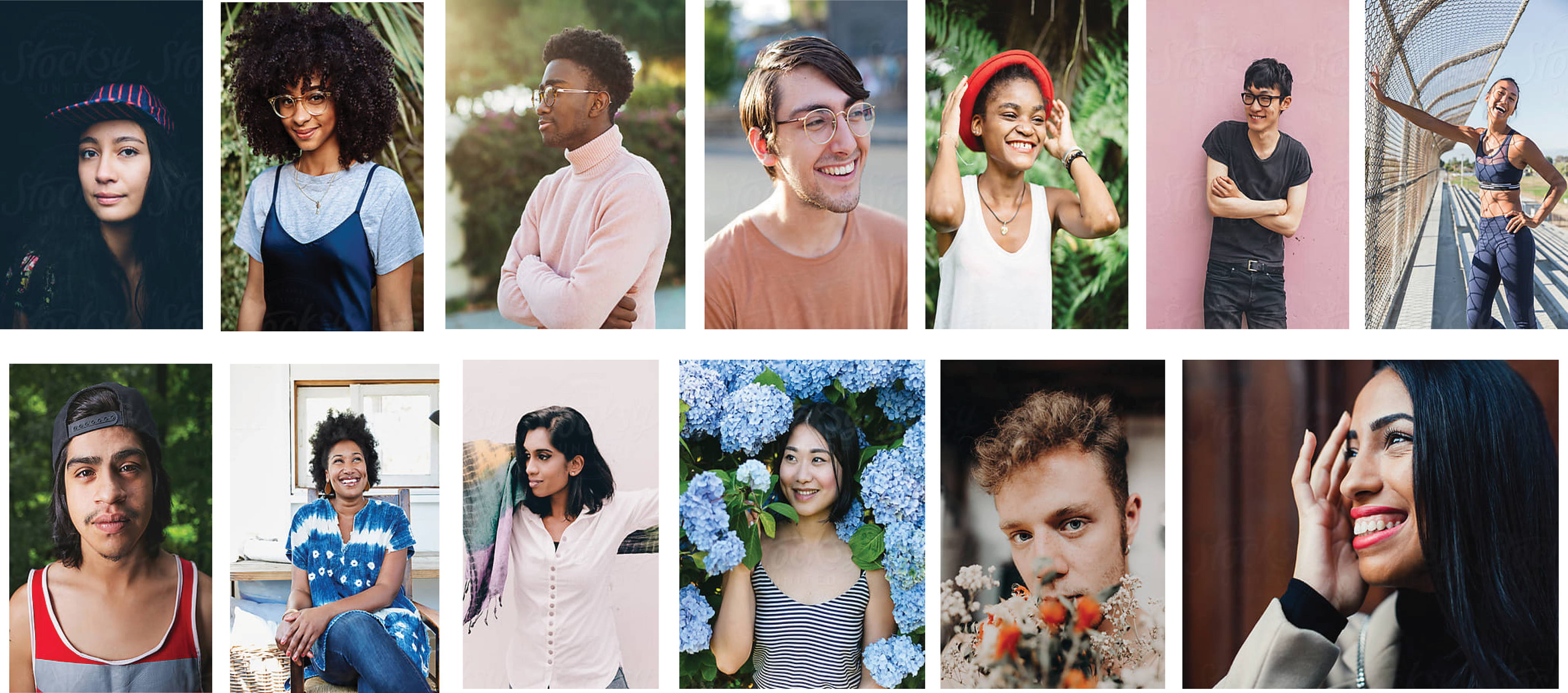
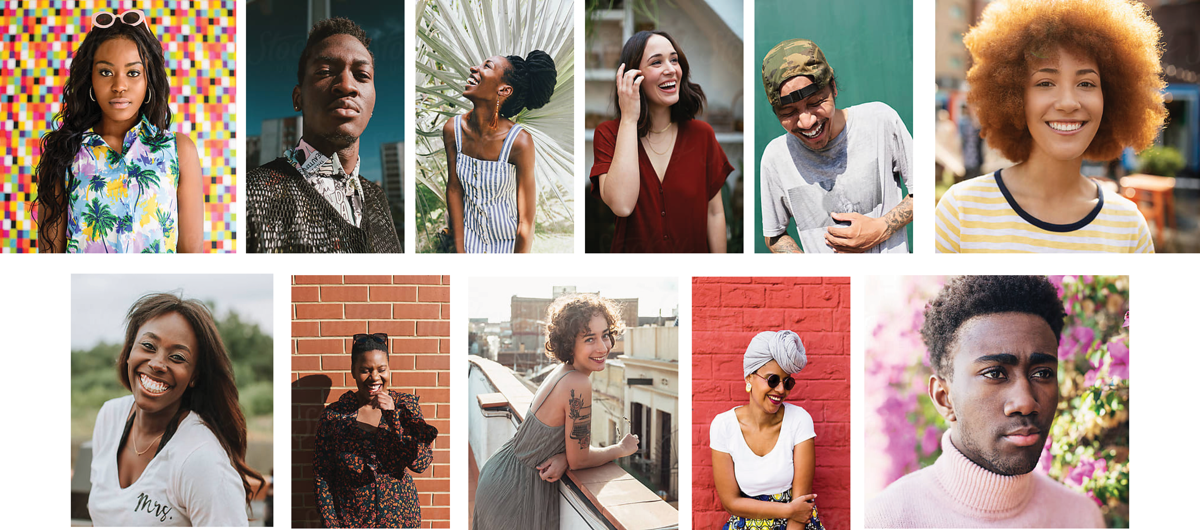
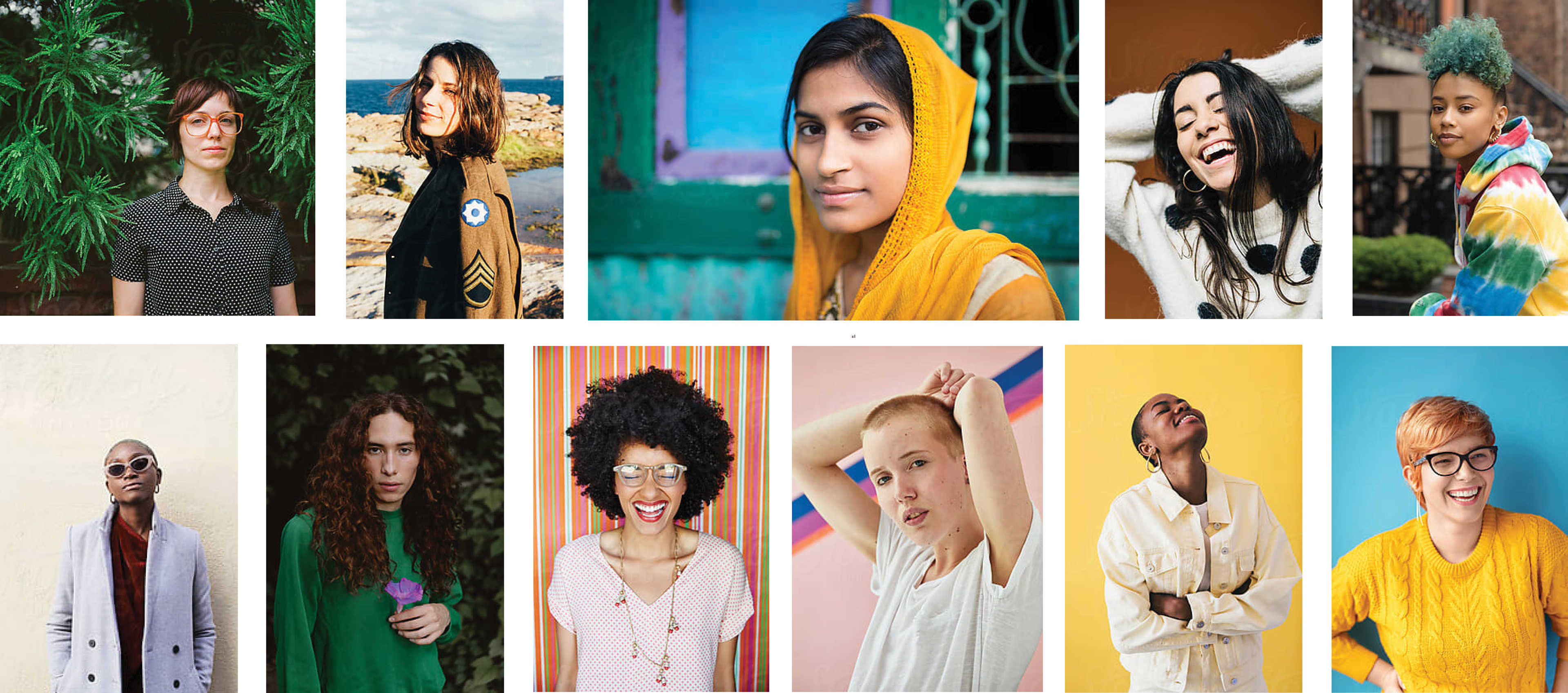
All images are proofs from stocksy
A Heavy Focus on Typography
Typography is what drove the design for the Viewbook cover which then lead to many additional layered type solutions for postcards, patterns and spreads. Not many people know that Texas State University marketing functions like a small, but robust creative firm equipped with teams of writers, videographers, photographers, an editor, designers and an amazing creative director. To highlight the brilliance of our writers development of the new and improved brand voice, I made sure to have type-only spreads that used color to emphasize and bring their words to life.
The Viewbook
Photography by Stephanie Schulz
The Roadpieces
Photography by Stephanie Schulz
Recruitment Postcard

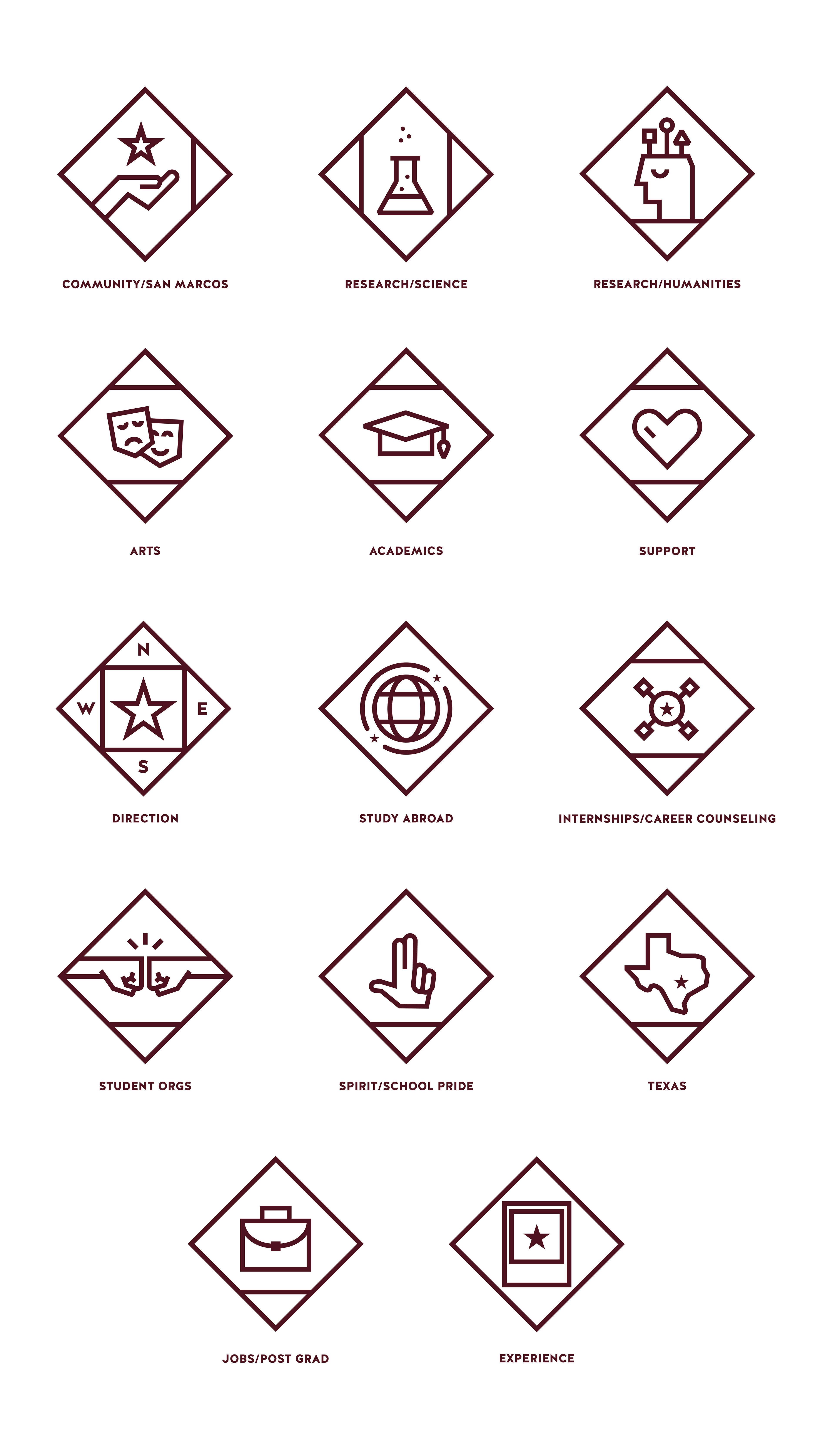
Icon System Development